
Making the Black Experience Impossible to Overlook
Black Creatives needed an identity that matched the significance of the gathering. The goal was to give Black people a meaningful place to go and make the experience feel thoughtful from the first impression.
Background
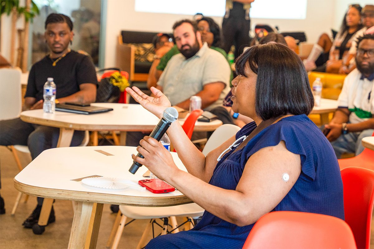
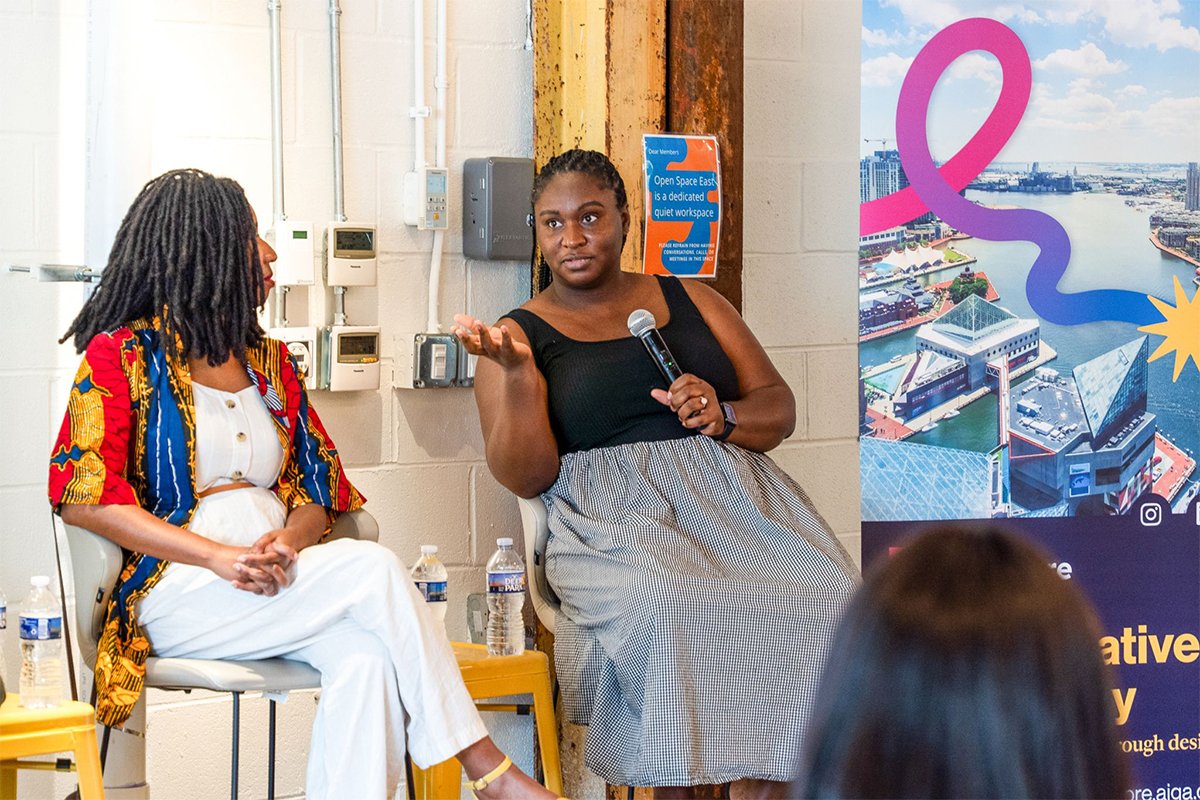
The event brought Black creatives together for an honest conversation about navigating spaces that were never designed with them in mind.
The identity needed to reflect the weight of that subject and create a warm, intentional setting.
Art Nouveau and African Inspiration
Afrocentric event branding often relies on familiar visual shorthand, including oversized type and saturated color.
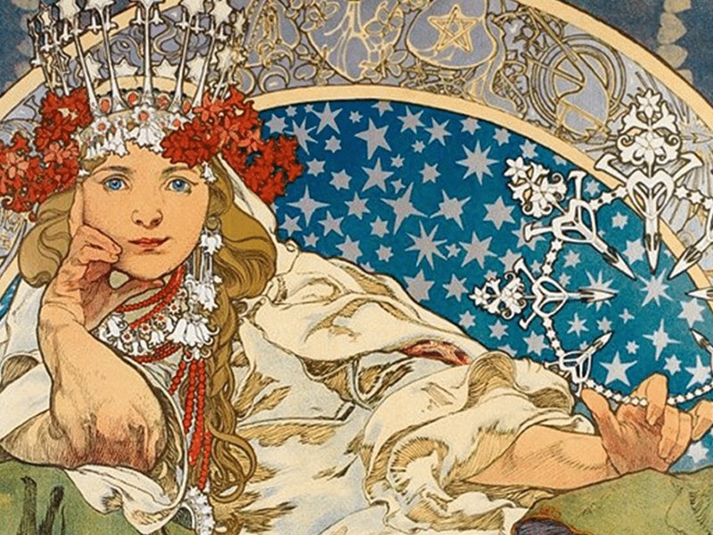
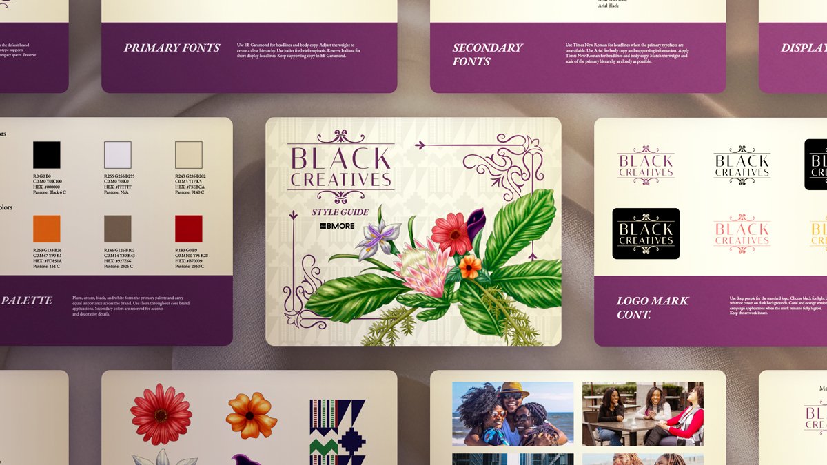
The creative direction explored a more elegant expression. Art Nouveau and Art Deco shaped the typography and decorative details, giving the identity a sense of refinement.
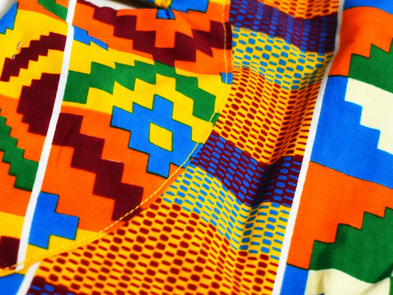
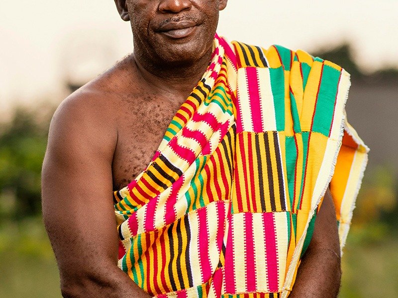
Kente cloth informed the pattern system. Popular motifs found across Africa were simplified into subtle graphic forms that added cultural depth throughout the experience.
African Botanicals
Botanical elements brought softness and movement into the visual system.
Their organic forms complemented the structured typography and decorative framing. This balance gave the identity a distinct character that felt expressive and polished.
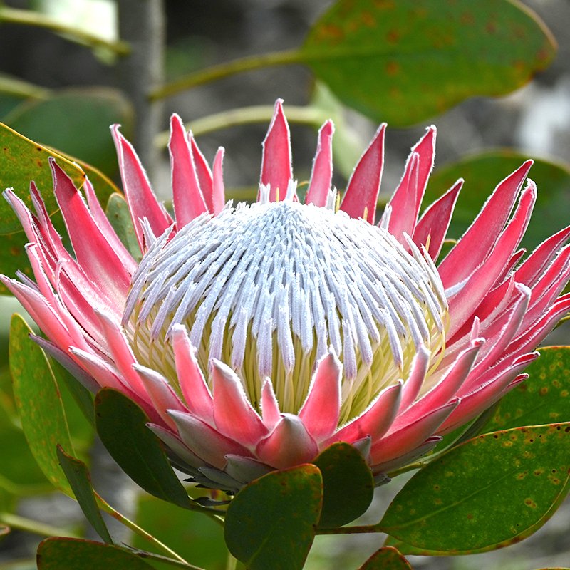
King Protea
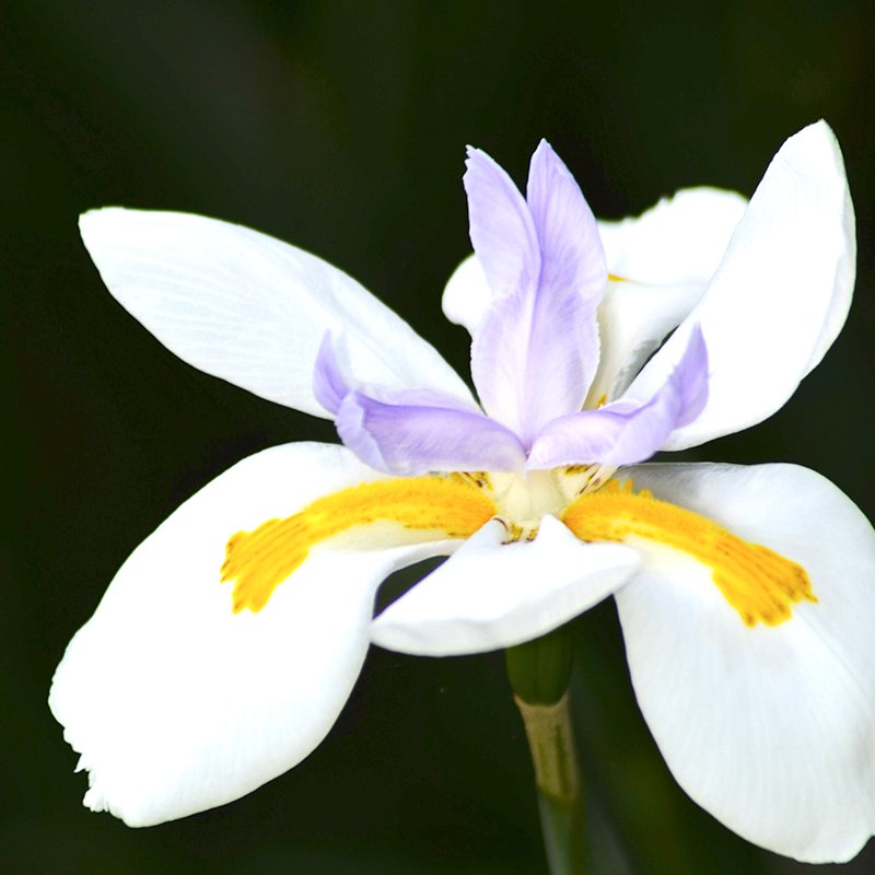
African Iris

Black Calla Lily

Asparagus Fern

Bird of Paradise

Cosmos Flower
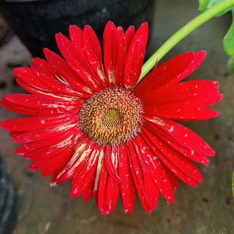
Red Daisy
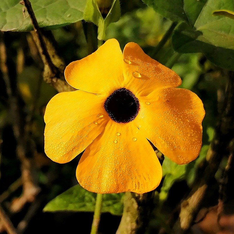
Black-eyed Susan vine
Building the Experience
The identity extended across social promotion and registration materials. It also shaped event signage and digital communications.
Each application used the same visual language, creating a cohesive presence from the first announcement through the final follow-up.
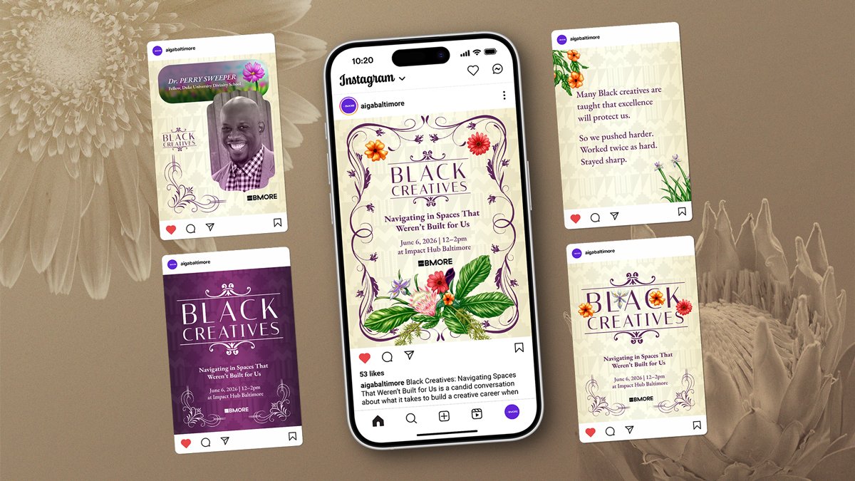
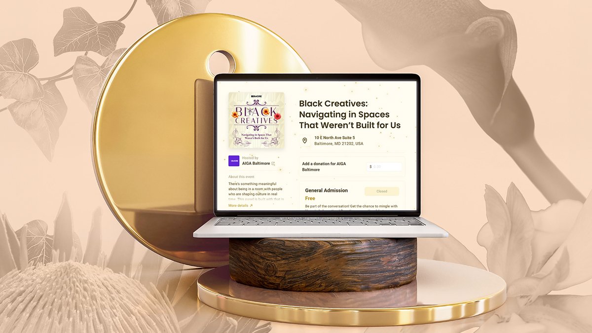
Black Creatives Event
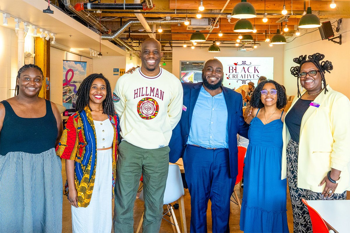
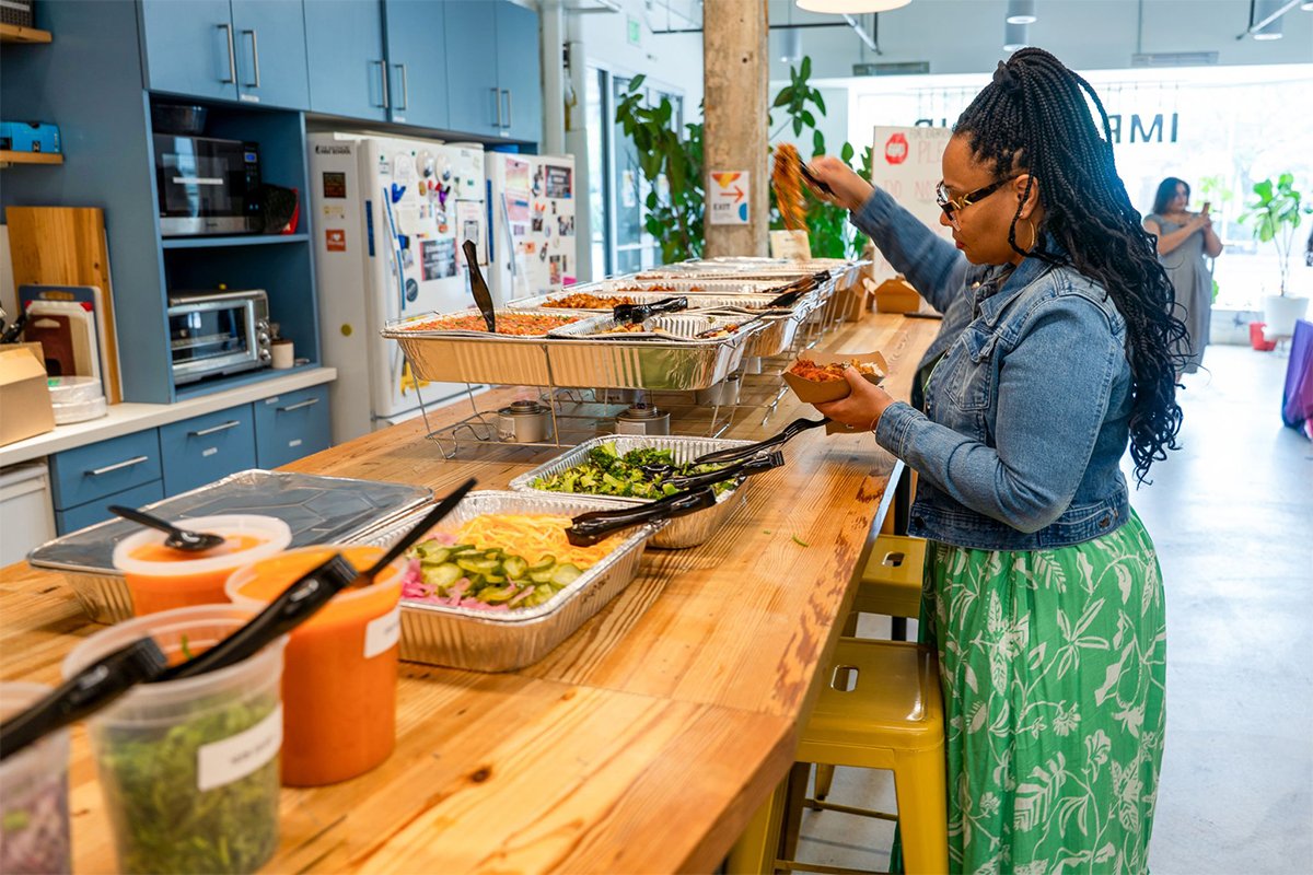
The completed identity established the tone before guests entered the room.
Every detail signaled that the gathering had been created with care. The result was an experience that felt worthy of the people and perspectives it brought together.
Create experiences your audience can trust.
Thoughtful design that strengthens pathways and engagement.