Where Mission and Messaging Intersect: A Fresh Look at Farm Credit’s Public Outreach
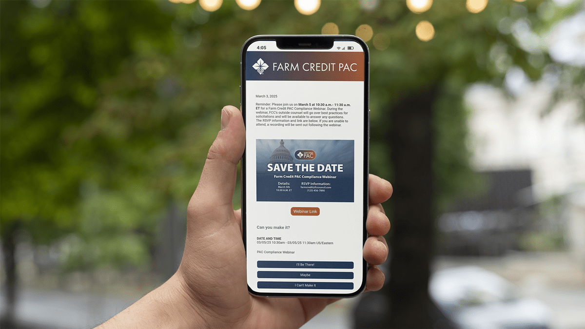
The Farm Credit Council Political Action Committee (PAC) helps the Farm Credit System effectively communicate in our nation’s capital. I led on creating a sub brand that was distinguishable from Farm Credit’s standardized brand.
Background
The PAC helps the Farm Credit System advocate effectively on behalf of agriculture and rural communities. Supported by grassroots engagement, the PAC plays an important role in educating Members of Congress on the issues that impact rural America.
Solution
The goal was to develop a sub-brand that stands apart from Farm Credit’s existing identity while still maintaining a clear connection to its core values. Drawing from Farm Credit’s signature navy blue, the design introduces a sense of patriotism, energy, and purpose that aligns with the PAC’s national presence. This approach not only clarifies the PAC’s role but also establishes a visual identity that reflects Farm Credit’s commitment to rural communities across the country.
Moodboard
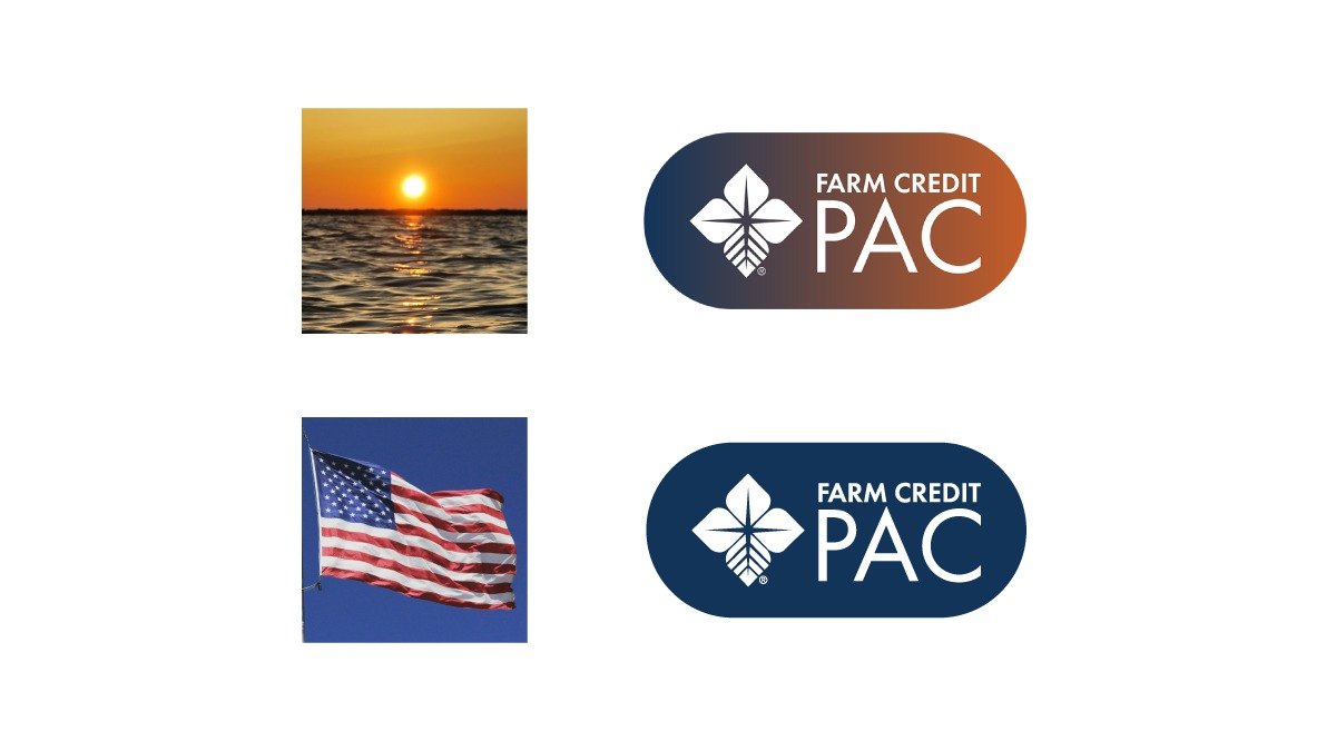
We started the process by assembling a moodboard centered on themes of civic engagement and national pride. These images helped establish a color direction and tone that balanced warmth with credibility, which ultimately shaped the visual system that followed.
Logo Sketches
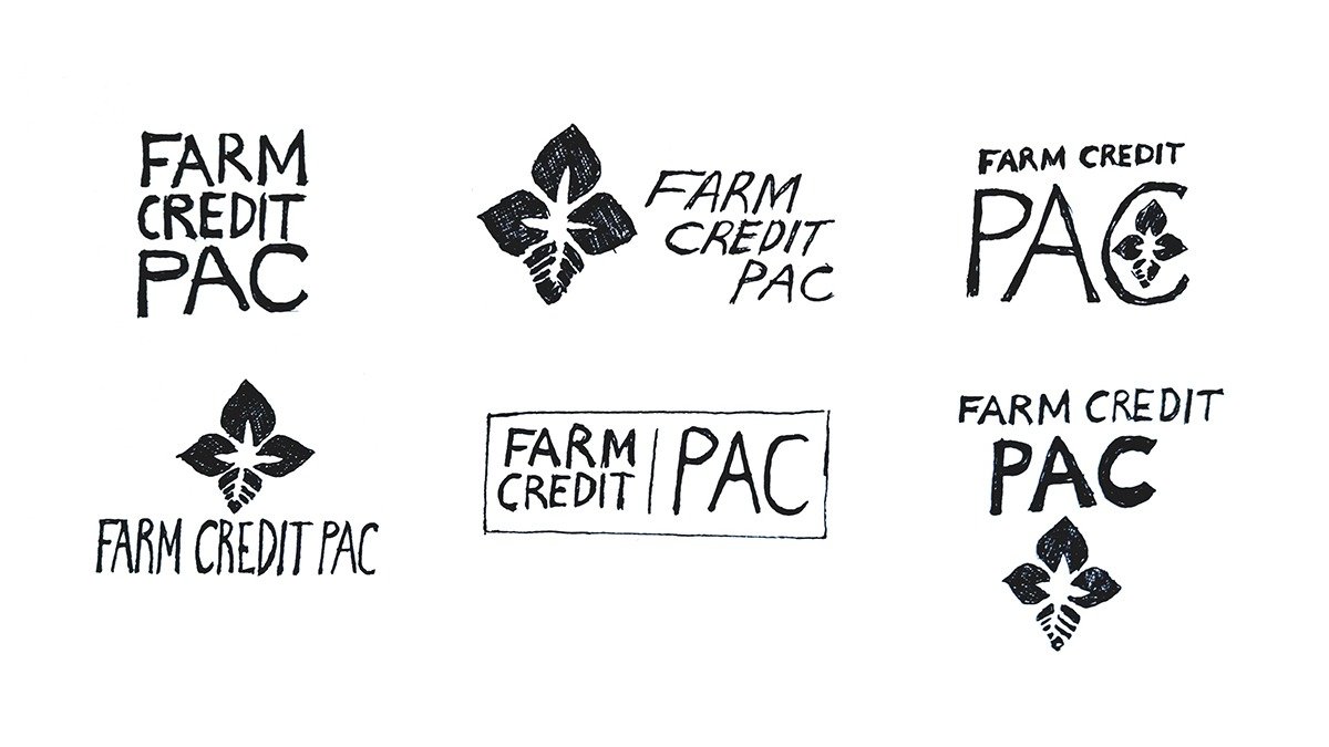
From there, we explored a range of logo concepts that offered unique directions while staying true to Farm Credit’s established brand standards. These early sketches helped narrow in on the tone, shape, and structure most appropriate for the sub-brand.
Finalized Concepts
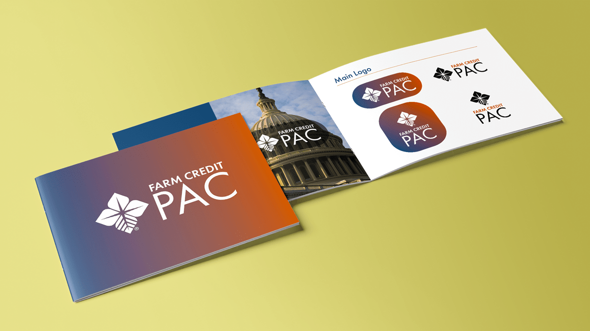
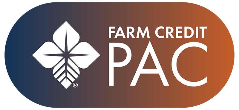
The final direction keeps Farm Credit’s signature BioStar but introduces gradients and tones that evoke a modern, civic feel. The logo and color palette highlight the PAC’s purpose while remaining grounded in Farm Credit’s mission.
Impact
While the initiative was not built around numerical KPIs, the sub-brand strengthened internal alignment and elevated the PAC’s presence across events and communications. The PAC identity continues to be used across Farm Credit’s public outreach, reinforcing a consistent and recognizable presence in its advocacy work.
Deliverables
Lead confidently through today’s
policy landscapes.
We develop messaging systems that help your brand navigate complex policy landscapes.


